Robert Rodriguez fineartprintsca

The art and interests of Robert Rodriguez

Month: March, 2017

IT WAS ONLY A PAPER MOON

I LIKE THE HIGH LIFE

Paper Moon Graphics, what a great place to work.   Almost complete freedom to do the art the way you wanted it.  I remember you would go in there sometimes with a sketchbook and show them your ideas and they would pick one and tell you to finish it up.  And it worked that way from the beginning, when I started with them.  Linda Barton, Robert Fitch, and Roger Carpenter all went with what worked, and it was a ground-breaking company.  They did often commission you to paint their ideas as well, but they trusted the artists to interpret everything and didn’t over direct.  Artwork is always so much better when the designer and the illustrator work together, rather than the art director telling you exactly how to handle every brushstroke.

I wasn’t in on why it ended, but I have an idea that it was because they were so good, that everyone copied them.  Of course the imitations were never as good, but they were probably cheaper to produce, and cheaper to buy.  But for anyone who worked for Paper Moon, it was something you will never forget.

I just remember, until Paper Moon cards, I used to buy these cartoony cards for whatever occasion, or make my own.  I was never really happy with what I used.  But once I saw the kind of cards Paper Moon was doing, I never bought anything else.  And Paper Moon was more expensive, but it didn’t matter.  It wasn’t even a consideration because the art was so superior, and the attitude was so cool.

COWBOY BOB

LUNCH COUNTER

On the extreme left (mostly cropped off) is a self-portrait.  I am also listed on the menu for $1.10.

adult motel

The bartender, the diner, and the adult motel were all originally done for Oui Magazine.

ESPECIALLY FOR YOU

MERMAID

PRANCING THROUGH THE SNOW copy

THE XMAS EXPRESS copy

Poor Santa, I somehow forgot one of his fingers.  A horrible toy-making accident, I suppose.

SANTA BMXmas

This image was originally an ad for Schwinn BMX bicycles.

TOYS copy

HOLIDAY HEART copy

REINDEER CROSSING

Robert Rodriguez is represented by Lindgren & Smith (212.397.7330)

STEVE COMES THROUGH

Two Jakes concept 1

Steven Chorney is the wonderful movie poster artist and illustrator who did the concept sketches for The Two Jakes in the very beginning.  I remember there were five of us who took these and developed them as comps, and even came up with other designs too.  I was assigned the first one he laid out.

I asked him if he still had the comps, and this morning he sent them along so I could post them.  I think Thomas Blackshear did a comp using a variation of the second design, which Steven said was his favorite concept because of the tension in Nicholson’s face.

Steven said he was thinking about the Scarface movie poster in his design.  Based on his days doing illustrations for TV Guide, he felt there was something missing from his sketch.  We needed the girl!  “…we need 2 guys, a girl, and a gun!”  He must have mentioned that to the art director, because by the time I got the job, they were asking for me to add the girl in there.

This was done back before color xeroxes were very accurate.  Steven had done the grey background version, but they had made a color copy for me, and it had turned a sort of acid yellow.  I loved it, so I  tried to match the color.  It reminded me of that Van Gogh painting of the pool hall interior with the  yellow lights and the green felt.  Van Gogh wrote “In my picture of the Night Café I have tried to express the idea that the café is a place where one can ruin oneself, go mad or commit a crime.” 

But even though they liked my Two Jakes art, they wanted to go with the grey of Steven’s original version (which I had never seen).  They had me hide Meg Tilly’s face with her hat, make Nicholson larger, and make his coat and lapels oversized.

The only bad experience with the whole project was the reference they gave me for Jack Nicholson’s face.   It was a blurry, two inch tall, b&w photo from The Witches of Eastwick.  I kept asking, “Seriously?  Jack Nicholson, and this is the best reference you have?”  I think I painted his head about 9″ tall on my poster.  And as it turned out, his face was the only problem anyone had with my image. (see my blog post, July 2013, for that story)

Two Jakes concept 2

the_two_jakes

ROUGHS, COMPS, AND FINISHES

ROUGH,COMP,FINISH

On illustration projects, the normal process is for the art director to either send me a very rough sketch or at least a description of what they want their painting to contain.  I thought it might be interesting to show the way it all comes about.  My roughs are usually so rough that I don’t even intend to show them to any client.  They are just for my own use to work out concepts and designs.  People often wonder how I can tell anything from the scribbles I do, but they really contain enough that I know if that direction is something I can develop or not.  I might fill pages with roughs like this, before I hit on one that works.  Nowadays, I do them digitally, but the idea is still to develop a sketch that shows promise.  I really don’t want to spend time making a good drawing.  I want to crank out as many ideas as possible, so I work very quickly.

It is interesting to me that when I hit on one decent direction, the pressure is off.  I know that I can always use the first good one if I can’t think of anything else.  But once that one is in the bag, I am free to really try other ways to approach the job, without worrying about results.  And it is usually one of the later sketches that I wind up going with, because they are a lot freer, and more adventurous.

Then I have to tighten things up a little so the art director and the client can understand what I have in mind.  This would be the comp stage.  I often do my comps in color, which sometimes isn’t a good idea, but it really helps me to think about what the finished art will look like.  But it also gets me in trouble because a client might perseverate on some color choice I’ve made, when I have always intended to adjust that in the final painting.  Also, sometimes a client falls in love with something that I may want to change in the finish, but they love it, so I can’t.  Even after all these years, I haven’t come up with a completely satisfactory way to present my sketches or comps.

I remember one project where the client said, “Don’t use any green.”  No explanation, just don’t do it.  Of course that is like telling someone, “Whatever you do, don’t dream about monkeys.”  That night, it is almost guaranteed that monkeys will be in every dream you have.  I remember struggling to do my painting with no green at all, and then breaking down because I just had to use green in one spot.  The art director loved the painting, and when I apologized for the little touch of green he said, “Oh, that wasn’t really important.  I just don’t particularly like green so that was a suggestion only.”  I spent hours trying to avoid that color, and it made no difference at all.

I hope  you can see how a rough sketch develops into the finish.  Each step takes me closer, and the design is finessed, and the colors are brought together.  Doing the finished art is a lot more involved than just getting the drawing tighter.  I’ve heard of artists that can see the finish in their heads before the start.  Wouldn’t that be wonderful?  That’s not me.  It is a step-by-step process, and every mark, requires another mark to tie in with it, until there is nothing else needed.  Then it is finished.

patriotic girl-sketch 2

The drum majorette was for the 60th anniversary of 3M electrical tape.  The first sketch was the art director’s rough, showing me what he wanted, then my rough to develop a direction, then my comp for him to approve, then my finish.

Bathina_MaybeBaby_CreativeBrief_v1

LAWYER SKETCH

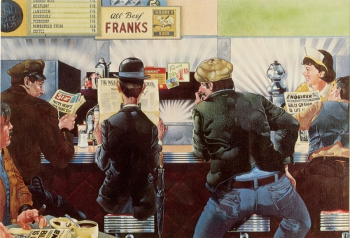
The two panels above show my rough for myself, then the comp for the art director and client approval, and then my finish.

the_two_jakes

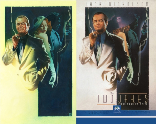
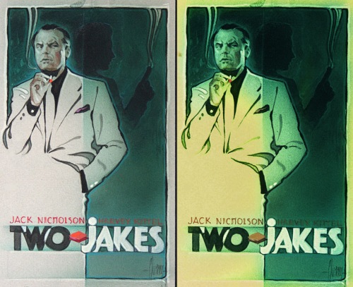
Movie posters were an entirely different thing.  Basically the comps were almost finished art.  This was my comp for The Two Jakes, and my finish.  I am going to post these two again sometime soon, because I want to include the sketch that Steve Chorney did that inspired this approach.  But I don’t have it right now.

ANDY GOLDSWORTHY: RIVERS AND TIDES

3c8dd4e8709c7da2921f4f641b491be8

Do you know his work?  There are very few abstract artists I like, and even fewer conceptual artists.  Conceptual art is a form of art where the idea is more important than the finished art itself.  I would have originally categorized Goldsworthy in that group, but that isn’t a valid description.  It is the process as well as the finished art that counts with his work.  He works with natural materials, and usually natural tools.  He works with ice, leaves, flowers, dirt, rocks, grasses, and his work is photographed as it is being created, when it is finished, and as it deteriorates.  All of this is an essential part of the artwork.  Amazingly beautiful work.

In the documentary film, Rivers and Tides, there is a scene where he is creating a screen of reeds held together with thorns, and hanging from a tree branch.  He is on the home stretch when a slight breeze comes up the hillside.  Goldsworthy holds up his hands to steady the screen, and just when it seems that everything might be okay, the whole thing collapses.  He sits there for a few seconds with his eyes closed,  he sighs, and then he picks up the reeds and begins again.  I think the narrator says it is the third time that has happened on the project.

His work is very organic and rooted in the natural world, as is his approach to it.  I want to try to develop the meditative quality he has to his art.  Maybe you won’t hear me scream anymore when things go wrong.

land-art-andy-goldsworthy-96

16622A

goldsworthy-andy-1989-touching-north

andygoldsworthy-ephemeraworks_p154-be947bd9c83d36423810b412da8281ccc8dac154-s800-c15