Dr. Pepper is my usual mode of caffeine delivery, but a day isn’t started properly without coffee. Did you know that New Orleans has been listed as the third most important city in the US for coffee? With my involvement in Tales of the Cocktail, I’ve been fascinated by the whole subculture of the mixologist. Now I am seeing the same thing happening with the barista culture, people who really know and care about creating the perfect cup of coffee. But recently I’ve been getting a behind the scenes look into the history and the growing and roasting of the beans from the owners (Bob Arceneaux and Tom Oliver) of Orleans Coffee. For instance, did you know that coffee cherries are actually sweet and can be eaten as a fruit? I understand there isn’t much to them, but they taste something like watermelon, rosewater, and hibiscus combined….I’ve also heard lychee and cantaloupe.
The reason for this sudden exposure to all things coffee is that Bob and Tom asked me to design their new packaging. Now this is an exciting project! I was supposed to show them 5 sketches but I got carried away and I think I showed up with 15. Here are a few of my favorites, and a little description of the thinking behind them.

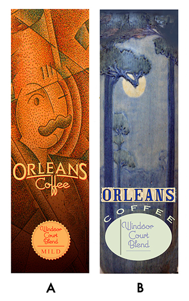
A. I stole it. The artwork is from Il Fornaio, and the logo is Orleans Coffee’s existing logo, restyled. I actually like their old logo and I just made the O and the S larger and changed the font on Coffee, with apologies to Michael Doret. I used his Orion font but changed the f’s a bit. The Il Fornaio artwork shows a chef, I was going to change it to a woman with a cup of coffee done in my style, but I like the colors a lot.
B. My Newcomb Pottery version. This was a flattened out version of one of Newcomb’s elegant vases. The Orleans lettering is iconically New Orleans since a lot of the streets, particularly in the Vieux Carré have their names set in tile on the street corners. I loved this direction but realized that the colors might not have the snap on grocery shelves that would be desired, and you can’t pump up the volume or it wouldn’t be Newcomb Pottery any longer.
C. This was one of my favorites. Again the street corner tiles for the logo, but the whole bag would be made of smaller tiles. A lot of the older shops in the city, particularly Angelo Brocato’s Ice Cream, have tiled entries with their names set in. That’s why there were leaves and shadows on it. And being a white bag, I think it would stand out on the shelves.
D. The color popped on this one. In the background would be a second line parade. I only used a painting of the Grand Marshall that I had done awhile ago, but if it was chosen, I would have done different musicians and dancers. My idea was to have them interlock and develop a pattern similar to Keith Haring’s dancing men, but fully painted.
E. My Cubist version. This would have been fun to develop. I planned to go around and take pictures of an espresso machine, a coffee grinder, the antique roaster at the company, and have someone make a fleur-de-lis in latte art for me to photograph. Then I would cut the pictures apart to make the cubist artwork. Something I’ve never done before, but I think it would work nicely.
F. What could be more New Orleans than a woman drinking coffee on a French Quarter balcony overlooking Jackson Square and the St. Louis Cathedral? I don’t remember who I owe apologies to for the woman I used, some French artist from the 1880’s, but I would have had to make up my own version of her if we had gone this direction.
G. A total type solution. Very rough but it is the general design I had in mind. I am completely in awe of those of type treatments of the 1890’s, and that’s where I was heading with this. It would be metallic gold in on a chocolate brown bag. And I think my favorite part was the gold ink that would be spattered down from the top. Fun.
H. This is still in progress, but I think it is the direction we are going. Things will change quite a bit between now and when it is finished, but generally it will be kept simple. A silhouetted woman savoring her coffee. My plan was to have the outlines and the fleur-de-lis grid in the background all be metallic gold. I was in Vienna over the summer and saw a lot of architecture by Otto Wagner whose favorite colors it seems, were white with gold leaf decorations. He convinced me. So clean, so elegant, and yet so rich at the same time.
Though there were other designs that had a lot to recommend them, these were my favorites. I will post the finished version when it is completed, but a lot of thinking is necessary before we get to that point.


